Your browser has a lot going on at the top of the screen. Address bar, bookmarks, tab rows, side panels — it all adds up to a surprising amount of visual noise. Vivaldi’s latest update asks a genuinely interesting question: what if you just… hid most of it?
Vivaldi 7.9 is out now, and the headline feature is a new auto-hide UI that lets you tuck away browser elements you don’t always need to see. Plus, there are two other additions worth knowing about. Let me walk you through what’s new, what works well, and what still needs a little polish.
Auto-Hide UI Clears the Clutter Fast
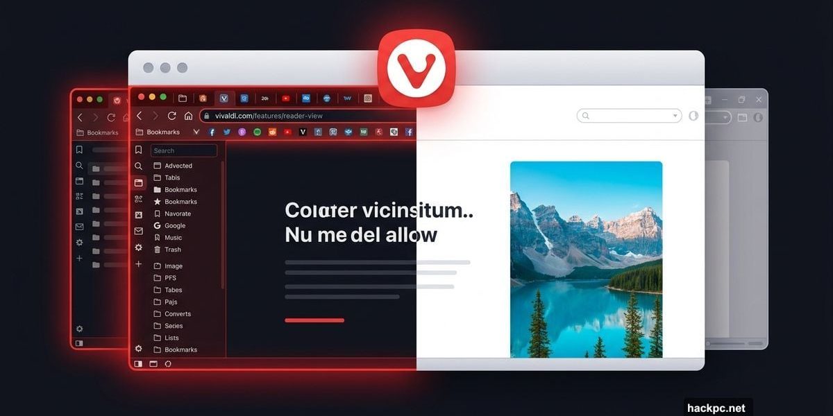
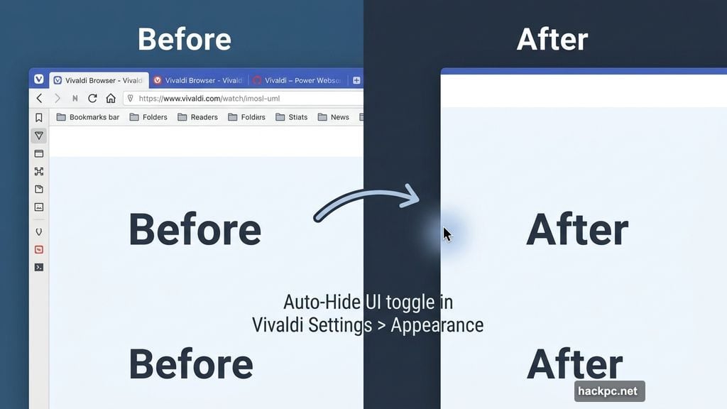
The idea is simple. Vivaldi lets you hide the parts of the browser that sit there taking up space — your tab bar, address bar, bookmarks, side panel, and status bar can all disappear when you’re not actively using them.
To turn it on, head into Vivaldi Settings, then navigate to the Appearance tab. From there, you can toggle off individual elements or go all-in and hide everything at once. You can also set the browser to auto-hide by default whenever it opens in full-screen mode, which is a nice touch for distraction-free reading or focused work sessions.
Here’s the key thing: nothing actually disappears permanently. Slide your mouse to the edge of the screen, and everything pops back into view immediately. It works a lot like the Windows taskbar auto-hide option — familiar behavior that most people already understand.
After testing this myself, I’ll be honest: hiding my tab bar feels a little unsettling. I’m keeping those visible. But the address bar is more tempting to tuck away, especially since I rarely need to see the full URL of whatever page I’m already on.
![Vivaldi 7.9 browser showing before and after comparison of the auto-hide UI feature with address bar and bookmarks hidden for a cleaner browsing interface]
This kind of clean-slate browsing isn’t entirely new territory. Microsoft Edge has let you hide the favorites bar for years. Back in 2023, the Arc browser introduced Boosts, which let users manually strip elements directly from websites — like removing the YouTube Shorts section from YouTube’s homepage. Vivaldi’s auto-hide goes further by applying that thinking to the browser chrome itself, not just page content.
You’ll need a few minutes to find your preferred setup. But once you dial it in, the result genuinely feels fresher and less cluttered.
Follower Tabs Tackle a Real Tab Management Problem
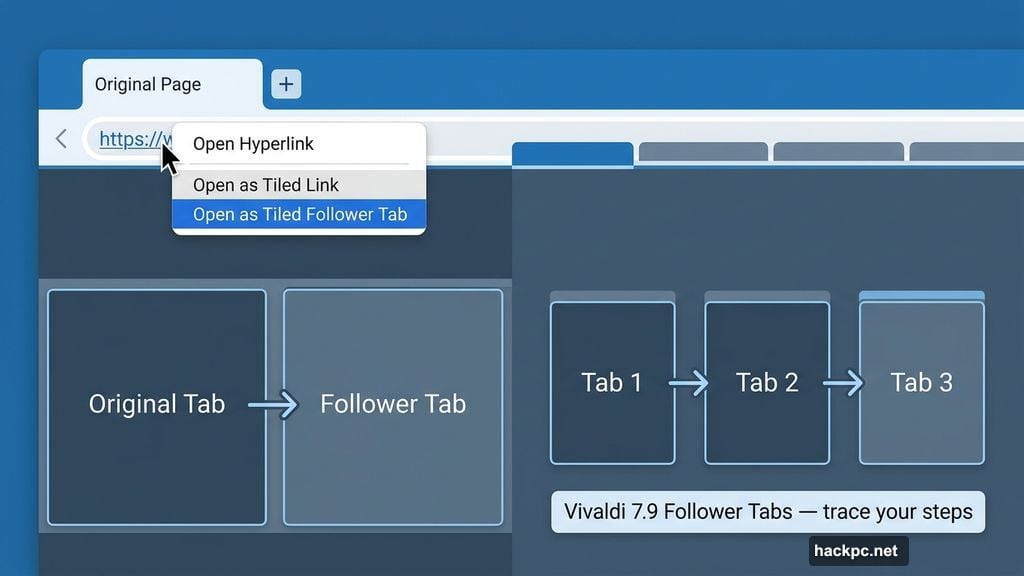
If you’ve ever opened a link from a page, then clicked another link from that, and then another, you know the feeling. Suddenly you have eight tabs open with no obvious way to trace your steps back to where you started.
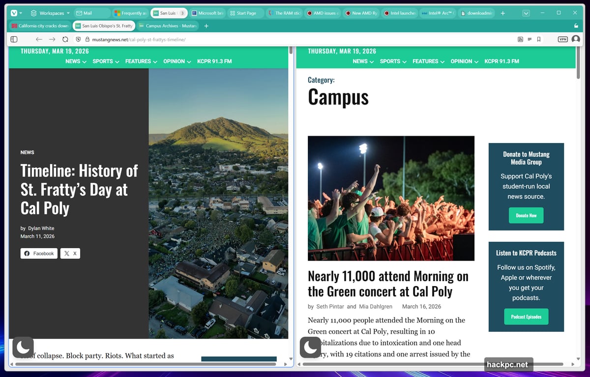
Vivaldi 7.9 introduces Follower Tabs as a direct answer to this. When you right-click a link inside Vivaldi, you can choose to open it as a “tiled follower tab.” The new page opens as a tile directly to the right of your current tab. Both the original tab and its followers then drop into a dedicated second row of tabs at the top of your browser, keeping your browsing trail visible and organized.
The concept is genuinely clever. Seeing the origin tab and its followers grouped together in their own row helps you understand the relationship between pages at a glance. That alone makes it easier to navigate back or close out a chain of related tabs when you’re done.
That said, I’m not fully convinced the feature is quite finished yet. When I opened a third tab in a follower chain, I expected it to join a tiled grid or at least a scrollable row of tiled windows. That didn’t happen the way I anticipated. It’s possible I missed a step, but the behavior felt inconsistent enough to notice.
![Vivaldi 7.9 Follower Tabs feature showing tiled tab layout with origin tab and follower tabs organized in a secondary tab row for better browsing organization]
Follower Tabs feel like a solid foundation with real potential. A bit more refinement on how chains of three or more tabs behave and it could become one of the best tab management tools in any browser. For now, it’s worth experimenting with, especially if tab chaos is a daily frustration.
Mail Composer Gets Its Own Window
The third update is smaller but genuinely useful for anyone who uses Vivaldi’s built-in mail client. The Mail composer can now open as its own separate window, rather than being confined to a panel inside the browser itself.
If you’ve ever tried to write an email while needing to reference a webpage at the same time, you’ll immediately understand why this matters. It removes a lot of awkward toggling and gives your email a proper dedicated workspace.
Vivaldi Keeps Earning Its Place
Vivaldi has already won a loyal following for reasons that go beyond surface-level customization. The built-in RSS feed reader alone makes it worth a spot in a dual-browser setup alongside something like Edge or Chrome. Features like auto-hide UI and Follower Tabs show that the team is still actively thinking about how browsers should actually work, not just how they’ve always worked.
Follower Tabs need a little more iteration to feel truly seamless. But the auto-hide UI? That one’s ready to use today. If you’ve ever wished your browser would just get out of the way, Vivaldi 7.9 is worth installing just to try it.
The next logical step for the team might be improving the sync experience, which has drawn some criticism from users. But as a standalone update, version 7.9 adds genuine value without overcomplicating things.


Comments (0)